One App. More Possibilities.
EasyBud is an all-in-one lifestyle application designed to simplify everyday urban activities—bringing together event booking, instant split payments, social networking, marketplace trade, and professional job connections into a single cohesive ecosystem.
The brand challenge was communicating this multifaceted versatility without diluting the core message. The creative identity needed to project approachable energy, youthful warmth, and the feeling that daily life is genuinely easier with EasyBud.
Creative Direction & Feature Poster Series
I conceptualized and designed a series of high-impact promotional posters and digital campaign creatives to spotlight EasyBud's flagship features, drive brand recognition across social media, and accelerate app downloads on Google Play and Apple App Store.
Each poster was structured around a high-relatability human scenario—whether splitting bills after dinner, asking for community support, shopping for deals, or booking weekend travel.
Spotlighting Flagship Product Pillars
Explore the individual feature campaigns designed to communicate complex multi-sided platform functionality with immediacy and emotional connection:
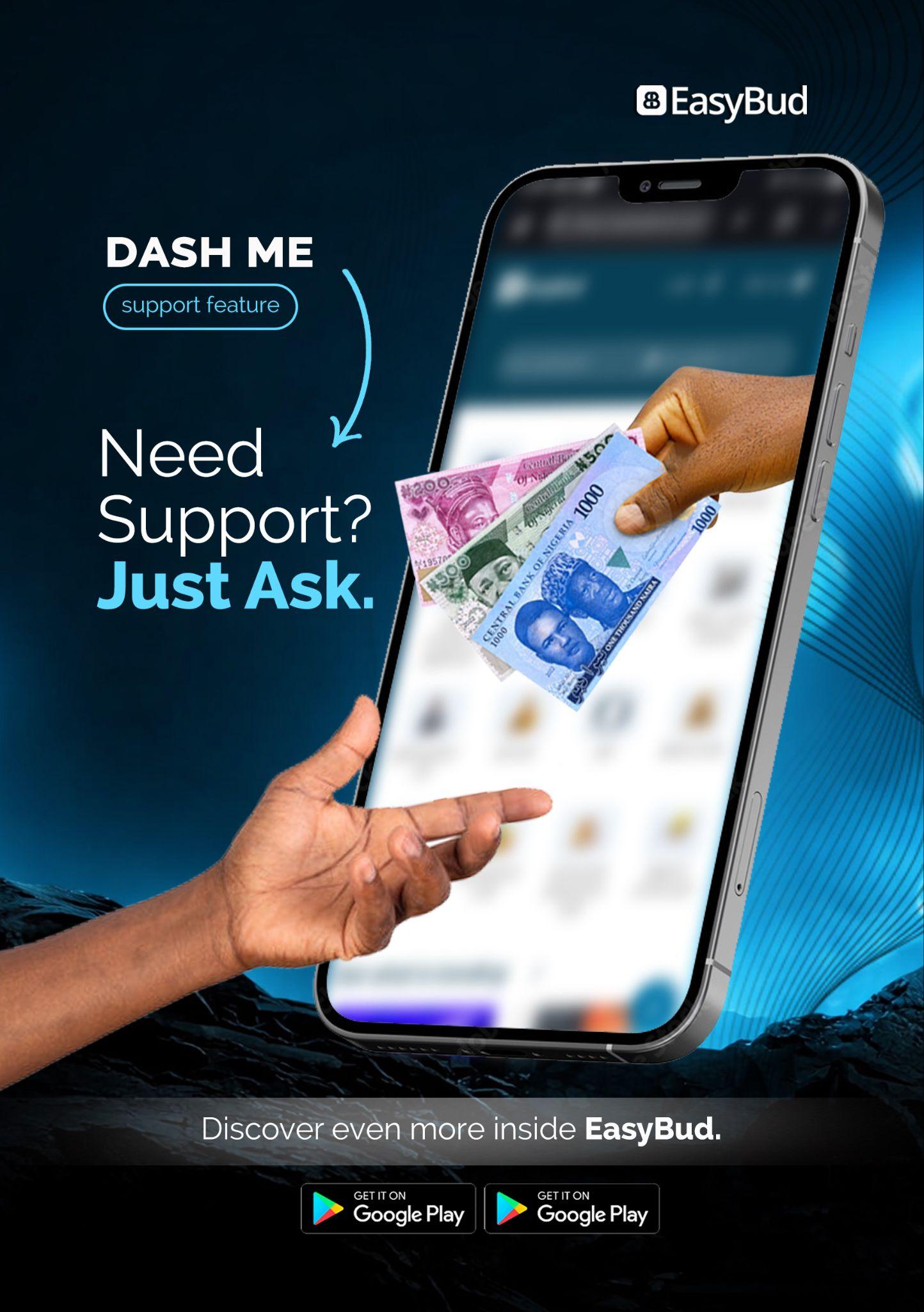
DASH ME — “Need Support? Just Ask.”
High-contrast visual highlighting seamless peer-to-peer micro-transfers and financial support, normalizing mutual aid through intuitive mobile gestures.
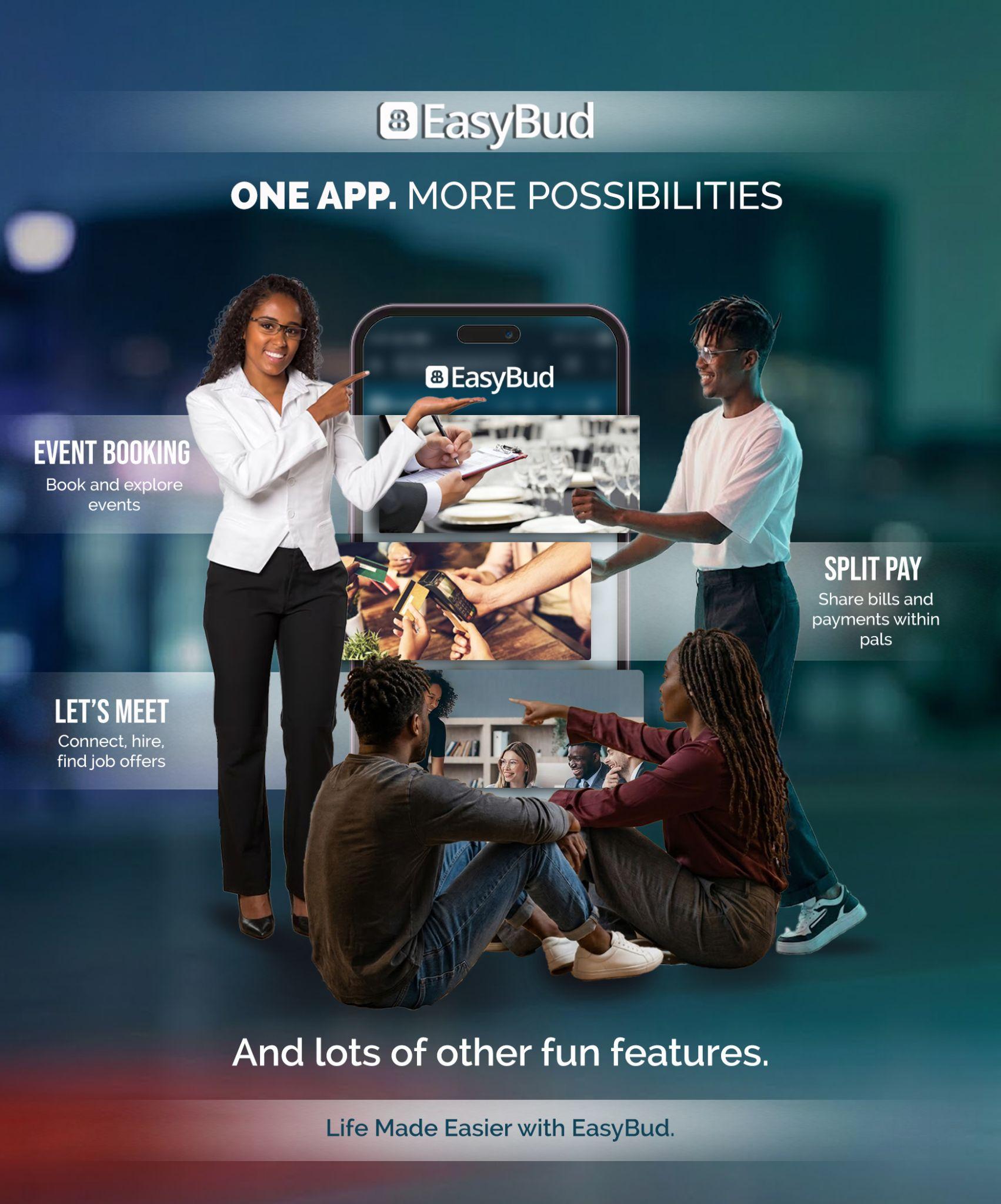
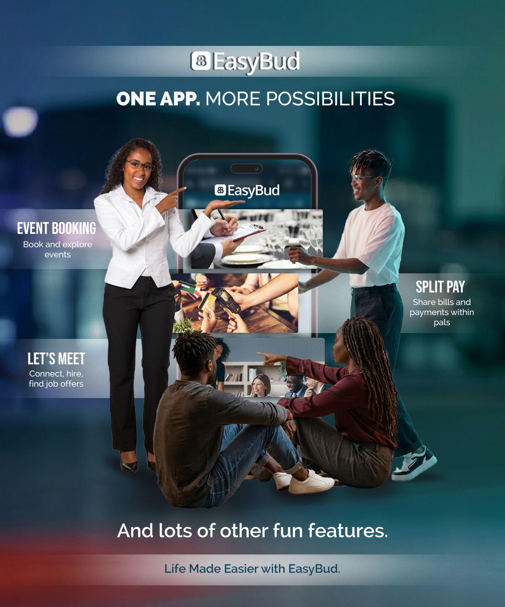
ONE APP. MORE POSSIBILITIES.
Dynamic multi-character layout unifying Event Booking, Split Pay, and Let's Meet networking against a stylish urban backdrop, delivering high brand authority.
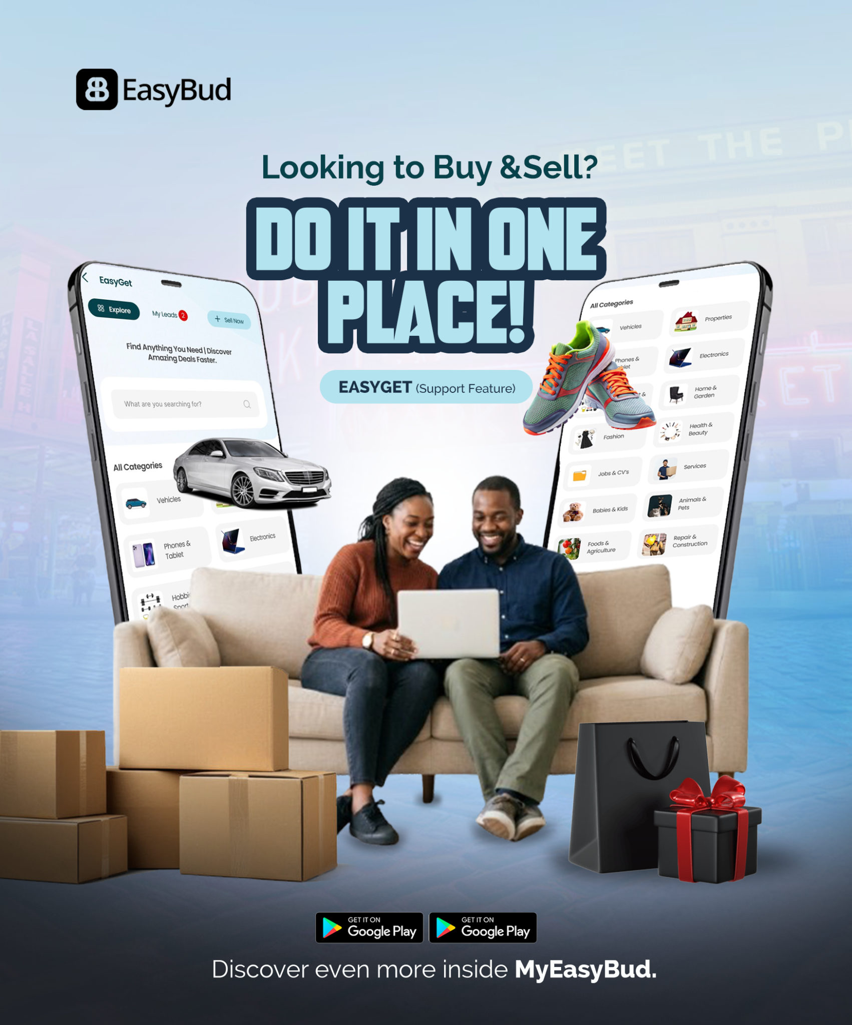
EASYGET — “Looking to Buy & Sell? Do It in One Place!”
Engaging living room scene showcasing classified commerce spanning vehicles, electronics, fashion, and home goods with 3D product-popping depth.
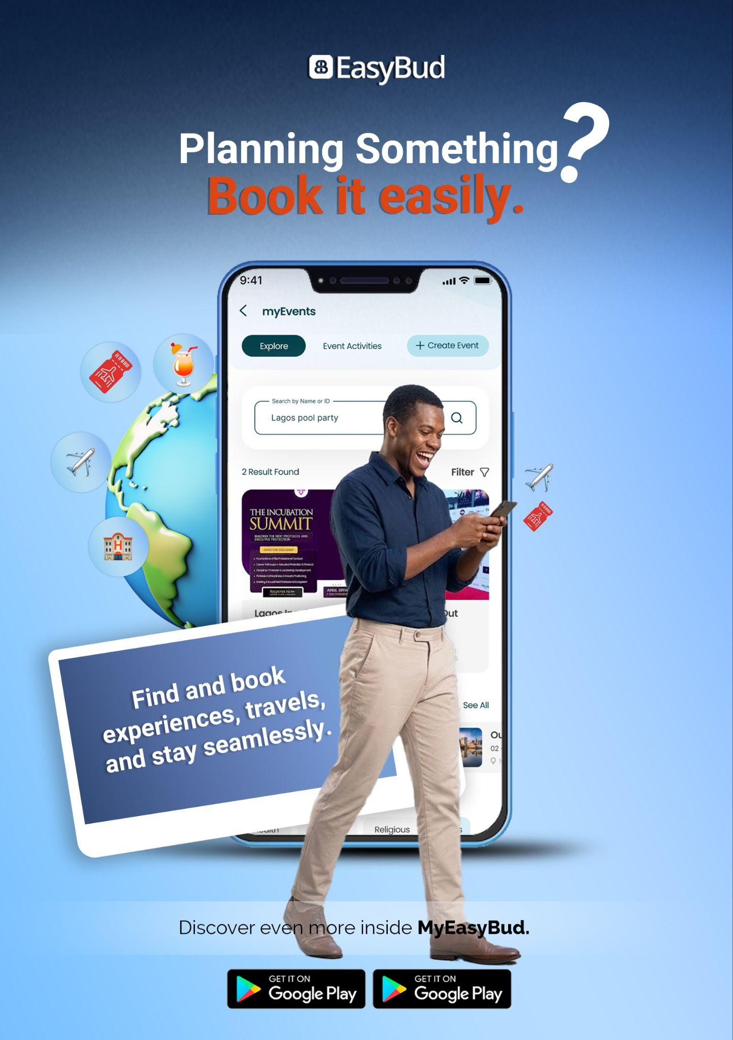
MYEVENTS — “Planning Something? Book It Easily.”
Vibrant, optimistic creative illustrating seamless ticket booking, travel reservations, and social gatherings with floating event tokens and global travel cues.
Human-Centered Photorealism & 3D Layering
The visual strategy centered on breaking the screen barrier. Rather than showing flat mockups, the designs feature authentic people interacting directly with floating mobile UI elements, symbolizing how EasyBud effortlessly blends into daily life.
- Color Harmony: Cool atmospheric blues and teal tones balanced with energizing coral and orange accents to guide visual hierarchy.
- App Store Clarity: High-visibility Google Play badges and clean headline typography engineered for instant readability on mobile feeds.
- Multi-Discipline Harmony: Bridging UI/UX mobile product design with commercial advertising aesthetics.
Life Made Easier with EasyBud
The campaign provided EasyBud with a versatile, high-energy visual foundation across promotional print, social feeds, and digital ad networks. By translating complex technical features into intuitive, emotionally engaging human narratives, the visuals successfully elevated user interest, established brand credibility, and positioned EasyBud as an indispensable everyday companion.