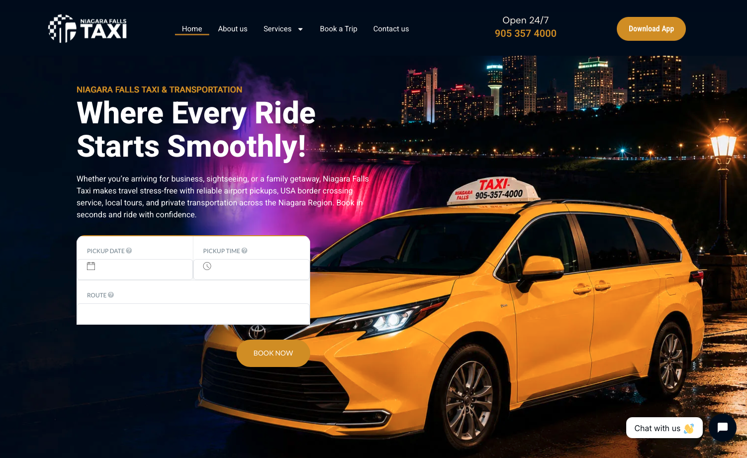
Elevating a Regional Transportation Icon
Niagara Falls Taxi needed a modern website that better represented its transportation services and made it easier for customers to find information and book a ride across airport pickups, USA border crossings, local tours, and regional private transit.
I redesigned the website from the ground up, focusing on clearer navigation, improved service discovery, and a more streamlined booking experience backed by search engine optimization and automated AI assistance.
Overcoming Outdated Visuals & Navigational Friction
The original website suffered from significant usability and credibility hurdles:
- Outdated Visual Styling: Used a basic design with a toy-like cartoon taxi graphic and clip-art aesthetic that undermined customer trust.
- Cluttered Page Hierarchy: An extensive, confusing page structure made content feel overwhelming and hard to browse.
- Weak Booking CTAs: The booking journey lacked prominent calls to action, requiring users to hunt for reservation pathways.
- Thin Service Content: Minimal information on specific service routes (airport shuttles, border crossings, wine tours) hindered search engine visibility.
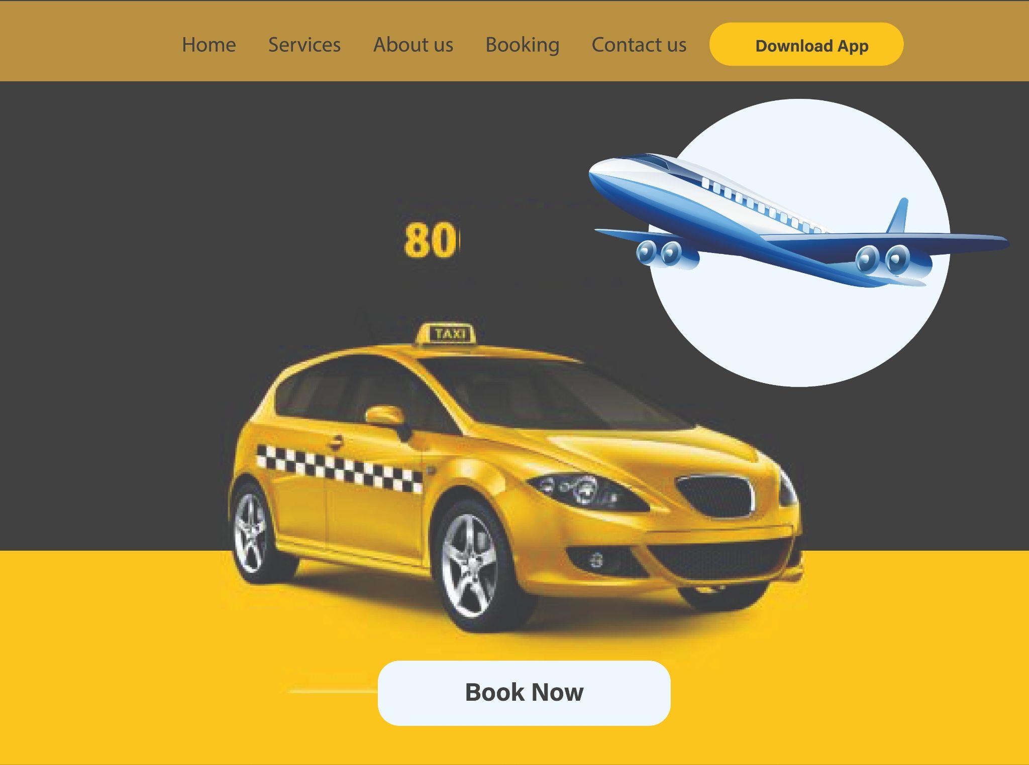
The original website featured a toy-like taxi illustration, minimal information, and low customer trust.
Auditing Regional Transportation Competitors
I reviewed competing taxi and private shuttle services in the Niagara Region to understand how they presented their offerings, handled pricing transparency, and guided visitors toward booking.
Using these insights, I systematically simplified the website architecture and established 5 core design priorities:
- Establish a professional first impression: Real photography, high visual polish, and instant trust cues.
- Make essential services easy to find: Clear categorization for airport transfers, cross-border rides, and local tours.
- Reduce navigation complexity: Streamline multi-level menus into an intuitive, high-level header.
- Give booking CTAs prominence: Place the booking widget directly on the hero fold.
- Optimize supporting SEO content: Comprehensive landing pages that rank for high-intent regional keywords.
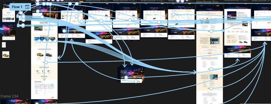
Figma wireflow mapping customer booking pathways, service taxonomy, and information architecture.
A Modern, User-Focused Booking Experience
To solve the legacy usability bottlenecks, the redesigned website introduced a cohesive visual design system, streamlined information architecture, and automated passenger assistance:
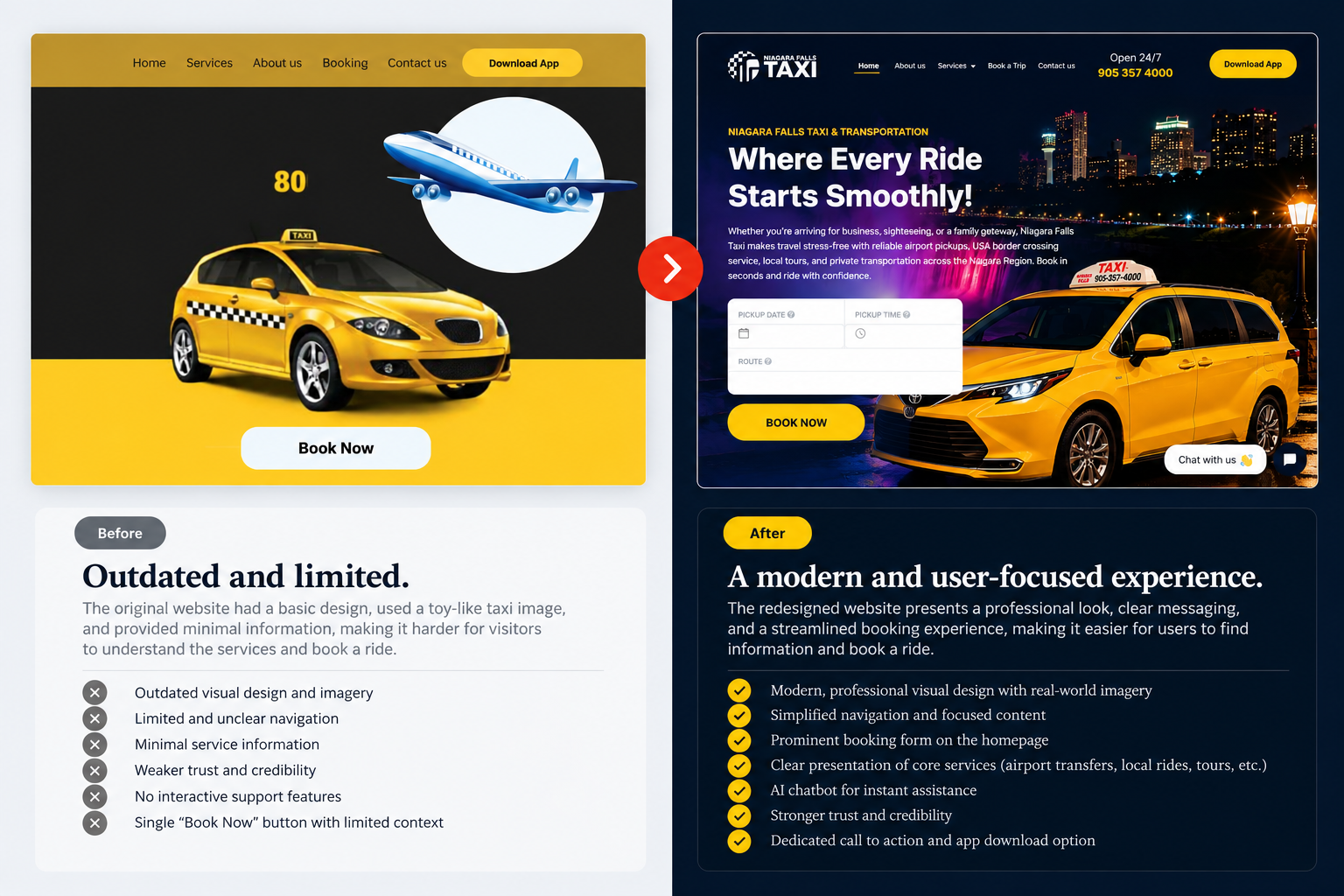
Direct before-and-after audit demonstrating the transformation in aesthetic authority, clarity, and booking prominence.
Modern Visual Identity
Replaced clip-art with authentic, real-world fleet photography set against the Niagara skyline at night. A sophisticated dark navy palette with vibrant golden taxi yellow accents commands immediate credibility.
Hero-Level Booking Widget
Integrated the booking date, time, and route selection directly inside the above-the-fold hero container, allowing customers to initiate ride reservations in under 10 seconds.
AI Chatbot Integration
Implemented a responsive 24/7 AI chatbot assistant ("Chat with us 👋") to answer rider FAQs, assist with instant quotes, and route travelers to direct support.
SEO-Driven Service Pages
Architected individual service hubs for Buffalo Airport pickups, Toronto Pearson shuttles, Niagara Wine Tours, and US Border Transfers, dramatically boosting organic visibility.
Measurable Commercial Impact
The redesign delivered a cohesive, high-converting digital experience that bridges the gap between regional branding and rapid customer conversion. By unifying modern visuals, transparent service discovery, effortless booking flows, and round-the-clock chatbot support, Niagara Falls Taxi now projects the dependable professionalism of a top-tier transit provider.
Project Summary
An outdated website with confusing navigation, toy-like graphics, and an unclear service presentation that hampered online bookings and compromised regional brand trust.
A complete ground-up redesign built on WordPress & Elementor, centered on user experience, instant booking access, SEO-aware service landing pages, and interactive AI chatbot support.